
__ 🇧🇷
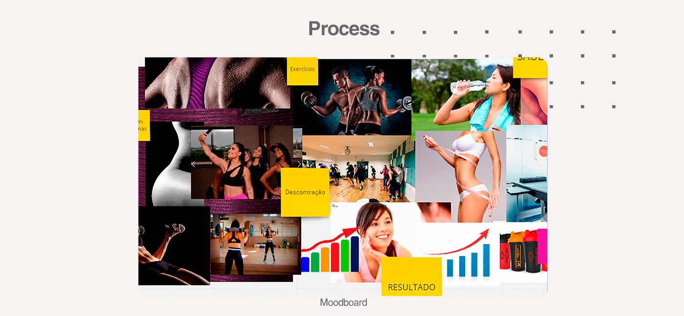
O projeto se trata do Rebranding do espaço Assis e Jones, um espaço exclusivo para mulheres onde o resultado é uma garantia, quando acompanhado do esforço das alunas. Sendo assim, foi solicitado uma mudança do logo que não representava mais a empresa. E no desenvolvimento do projeto, conseguimos reunir grande parte dos conceitos estudados e levantados depois de algumas análises e pesquisas.
O projeto se trata do Rebranding do espaço Assis e Jones, um espaço exclusivo para mulheres onde o resultado é uma garantia, quando acompanhado do esforço das alunas. Sendo assim, foi solicitado uma mudança do logo que não representava mais a empresa. E no desenvolvimento do projeto, conseguimos reunir grande parte dos conceitos estudados e levantados depois de algumas análises e pesquisas.
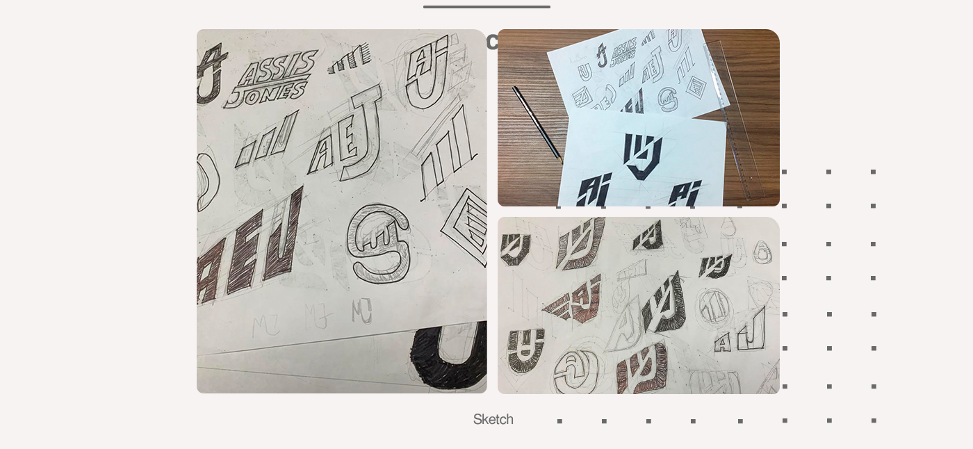
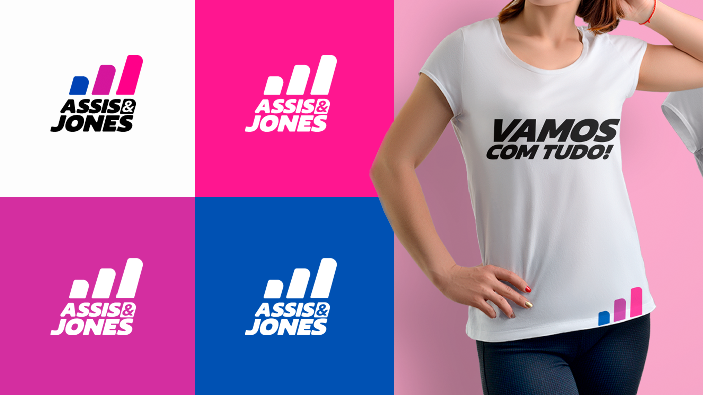
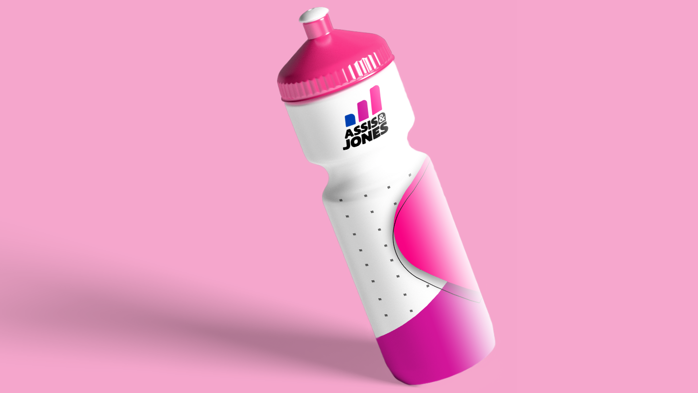
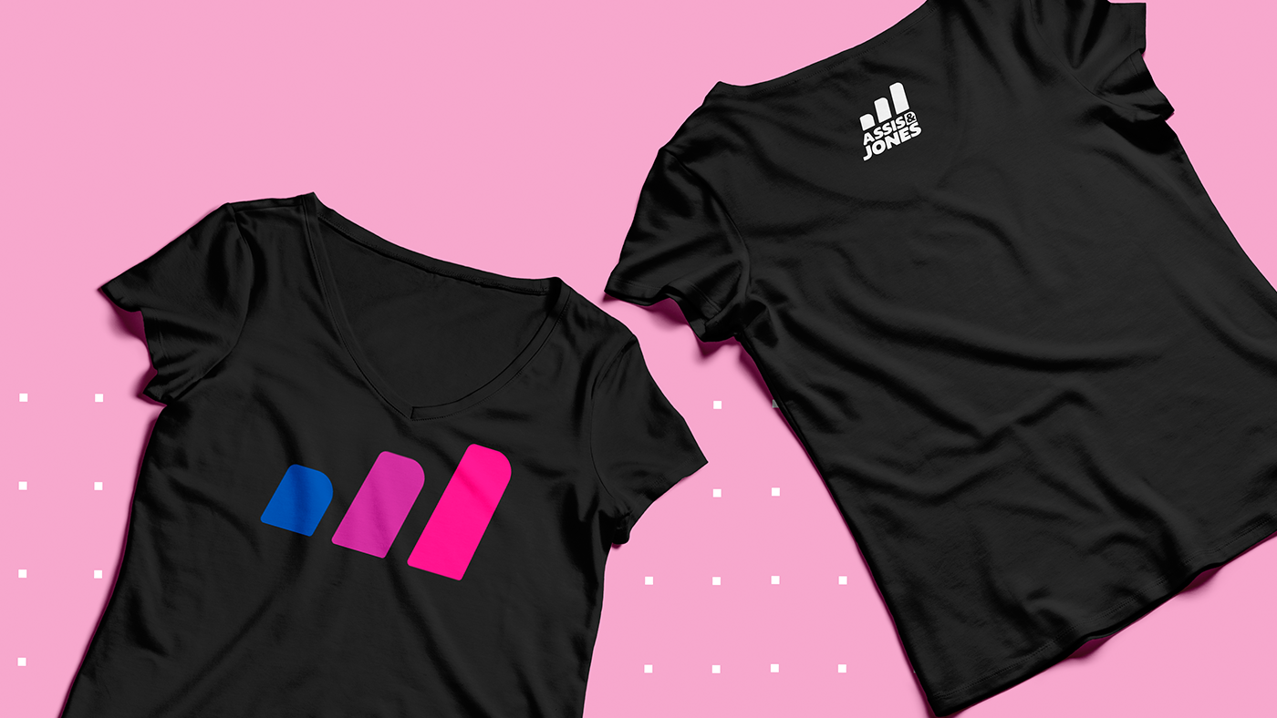
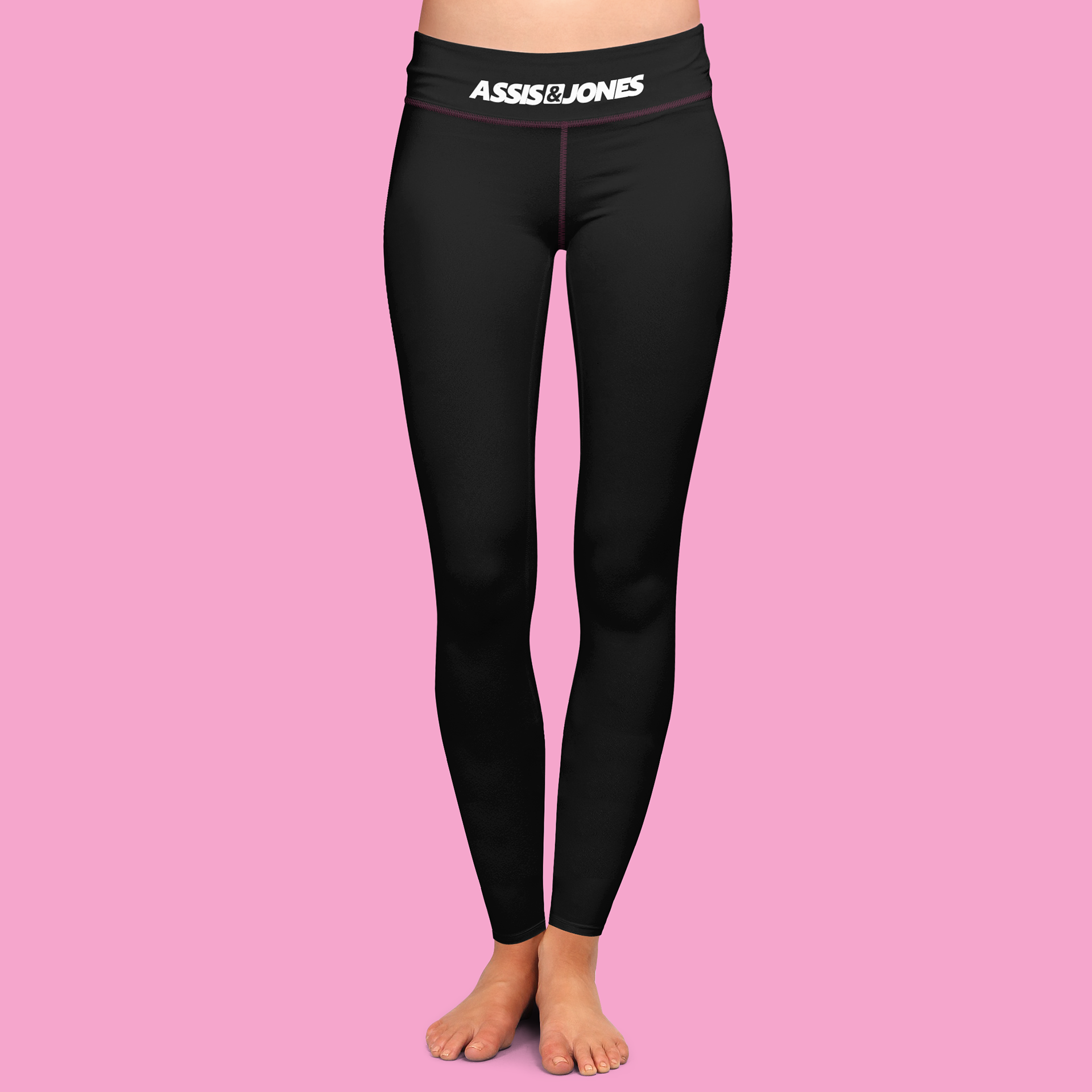
Selecionamos 3 pilares como sendo os principais da marca: resultado, movimento e o corpo feminino.O simbolo é a representação do progresso, do resultado sendo obtido com o passar do tempo. O movimento está presente, com a inclinação de 05º pra direita. E conseguimos trazer o lado feminino com o as curvas e formatos arredondados do símbolo e tipografia.
__ 🇺🇸
__ 🇺🇸
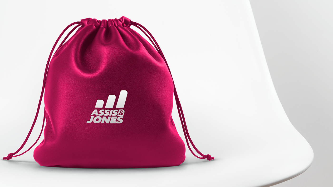
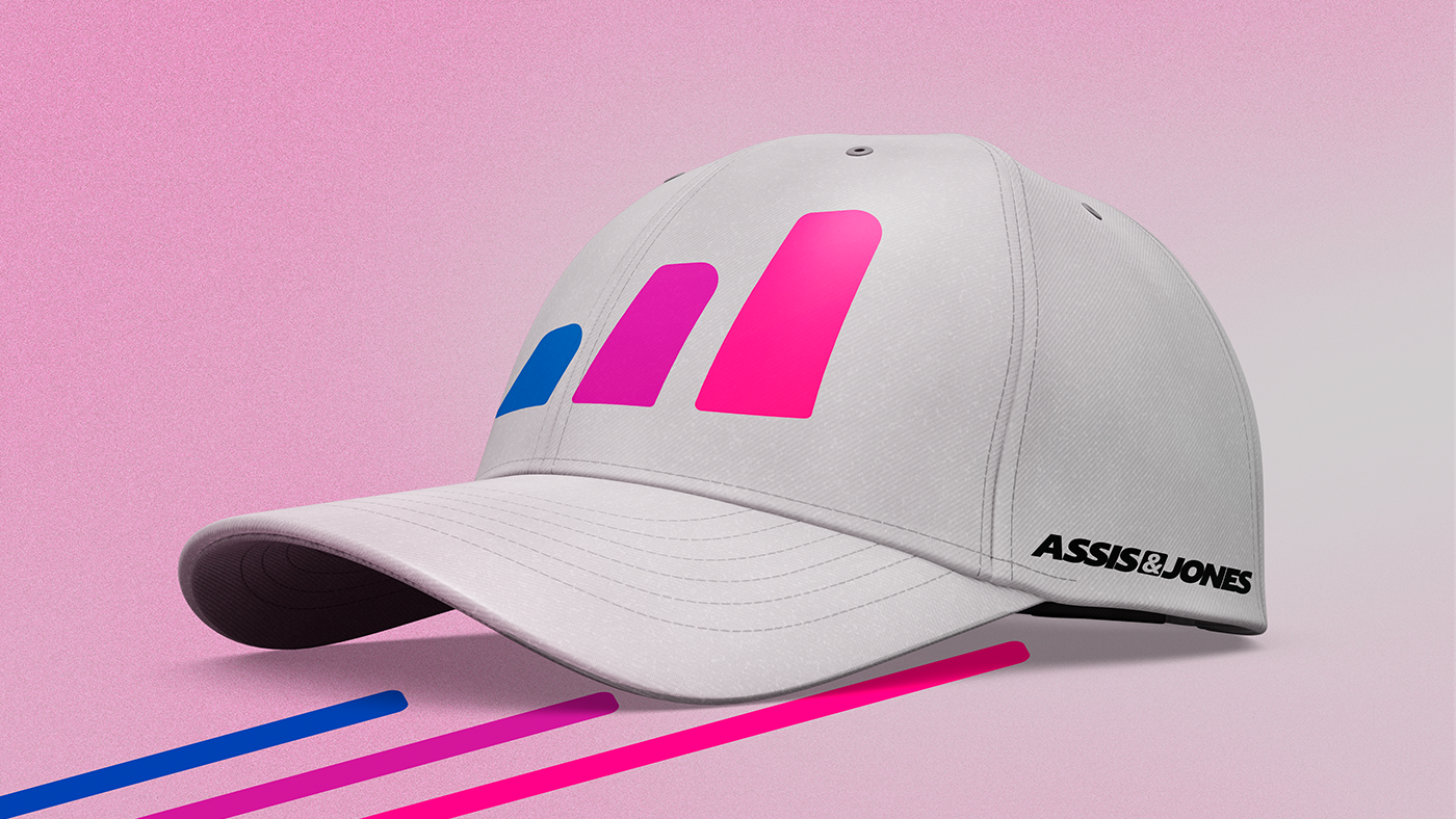
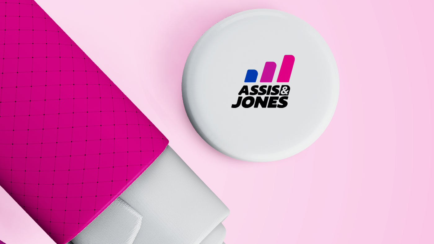
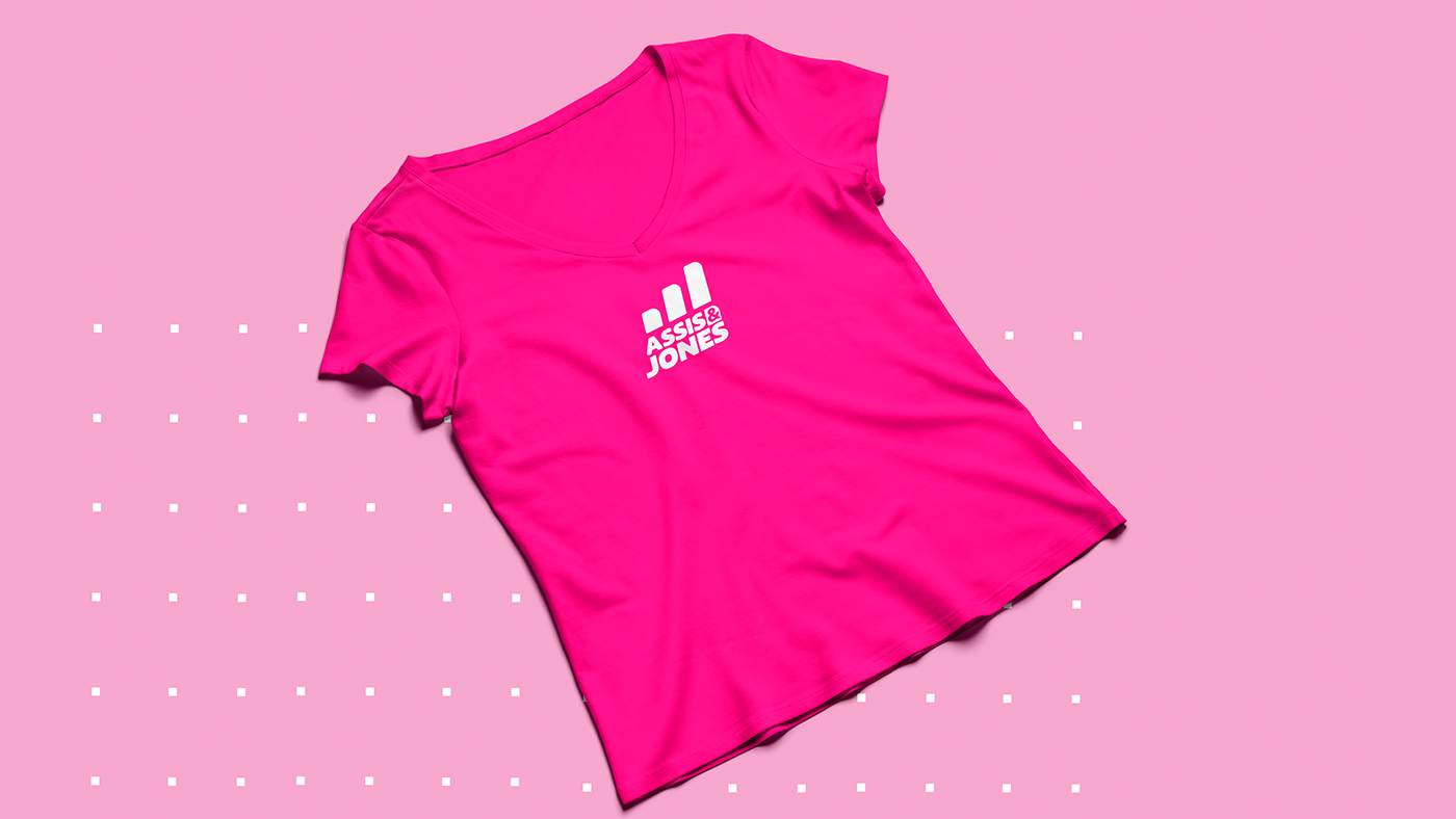
The project is about the Rebranding of Assis and Jones space, an exclusive space for women where the result is a guarantee, when accompanied by the person efforts. So, a change of logo was requested, which the old one no longer represented the company. And in the development of the project, we managed to gather much of the concepts studied and raised after some analysis and research.
We selected 3 pillars as the main ones of the brand: result, movement and the female body. The symbol is the representation of progress, of the result being obtained over time. The movement is present, with the slope of 05º to the right. And we can bring the feminine side with the curves and round shapes of the symbol and typography.
We selected 3 pillars as the main ones of the brand: result, movement and the female body. The symbol is the representation of progress, of the result being obtained over time. The movement is present, with the slope of 05º to the right. And we can bring the feminine side with the curves and round shapes of the symbol and typography.